Aleksanteri Karanka
H
e
l
l
o
 ðŸ‘‹
I’m saska, a digital designer with a web developer background. This site is a showcase of my favourite design works.

Works

Me

My name is Aleksanteri Karanka though people usually call me saska. I was born in 1991 in Tampere, Finland, where I’m still living to this day.

I've worked as a full-time designer for ~year. Before that I worked as a full-stack developer (ranging from WordPress to mobile app development) for ~five years. In 2022 I also became a certified Web Accessibility Specialist .

At the moment (January 2023) I'm happily employed at Vincit as a UI Designer / Accessibility Expert.
Visual Rama

Visual RAMA

Web design
2022

Background

Back in 2018 I created a WordPress website for Visual RAMA, an advertising agency with a focus on photography. Back then the layout and design decisions were made by the client and I only provided the technical implementation. But when they contacted me about a larger update four years later in 2022, I offered to help them on a condition that we’d rebuild the whole site with me on the designer’s seat.

Considerations

One of the ideas of the original site was to use abstract photos as a background for the site. However, this never worked that well in practice: different screen sizes and varying content meant that there was always a combination that just didn't look right. With the new update the amount of content would multiply several times over and it just wasn't sustainable. One of the goals for the new design was solving that problem while still retaining the original idea.

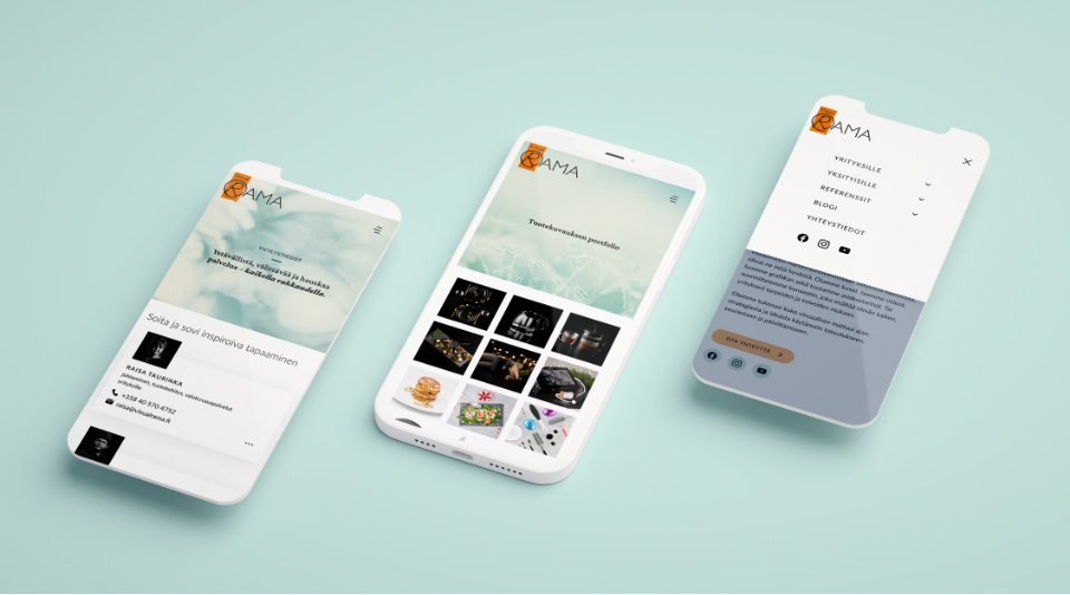
Three different views of Visual RAMA website on mobile devices.

On restraint

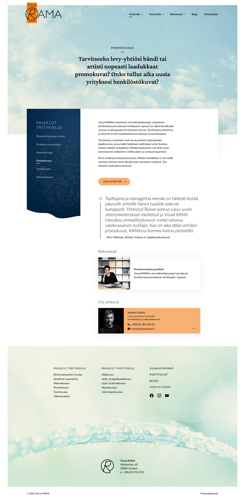
One of the more interesting aspects of the new design is how restraint with colors is used as a tool to achieve design goals. In this case we limit the use of orange, the brand color of Visual RAMA, and instead focus on the colors at the opposite side of the color wheel: blue and turquoise. Orange is only ever used in two places: 1. The logo at the top of the page and 2. call to actions. This way we can elegantly guide user attention towards call to actions.

A screenshot of the new Visual RAMA web site.

Result

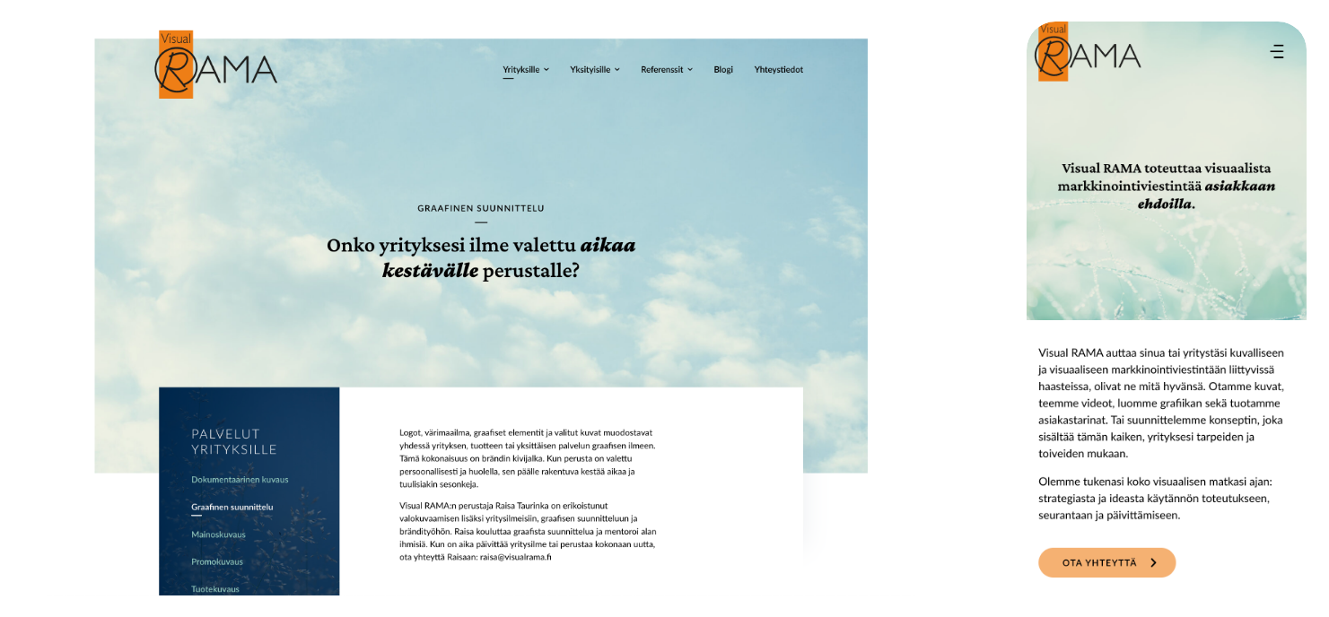
The new web site has a fresh look with more white space and lighter atmosphere. The streamlined primary navigation, page navigation and layouts now support more clearly defined user paths. The thing about abstract photos as page elements? That’s still there for elements with heavily constrained content, like hero and footer, which I have handcrafted to work nicely on all screen sizes. Also, these elements have a small frame around them making them feel a bit like individual little art pieces. Isn’t that a cool touch!

Visual RAMA website shown on desktop and mobile devices.
Tools
XD, Illustrator, Photoshop
Typefaces
Lato, Crimson Pro
Visit